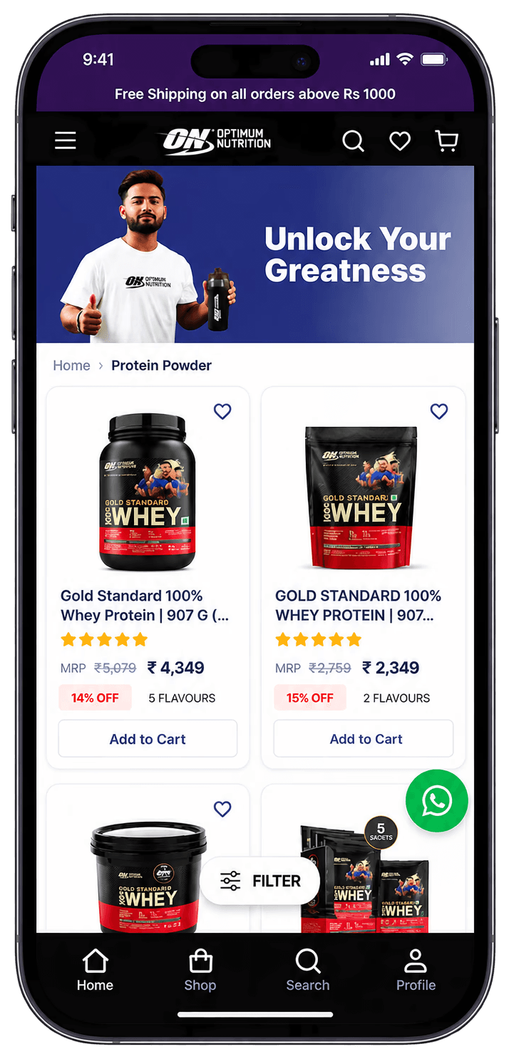
The Challenge
Strong brand recognition does not guarantee a strong ecommerce UX. Optimum Nutrition had accumulated friction across the core purchase journey with no structured evidence base for where and why the experience was failing users. The disconnect between brand quality and digital experience quality was measurable but unmapped. A UI audit was the starting point.
Brand First
Audit before design. The phased structure separated evidence-gathering from creative output. A rigorous UX heuristic evaluation across Homepage, PLP, PDP, Cart, and Checkout on both mobile and desktop. Competitive benchmarking against category peers. Findings converted into an opportunity map ranked by impact versus implementation effort. Every recommendation validated against Shopify's technical feasibility before design work began. Nothing theoretical. This is how a proper UI audit for retail website design should be run.


Quick Win Implementation
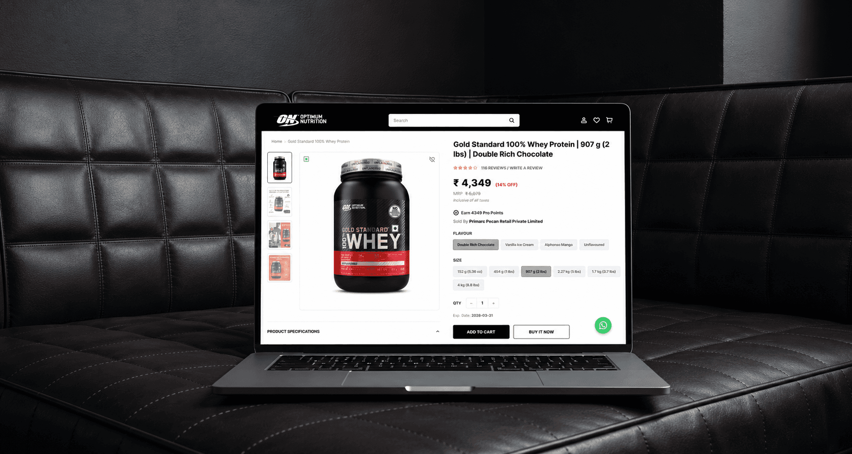
Highest-value, lowest-effort improvements designed first. Each quick win wireframed, refined, and delivered as final Figma UI, developer-ready with design QA support during build. The Optimum Nutrition team had clear, actionable improvements they could move on immediately.
Long-Term Implementation
Structural improvements to UX architecture, component patterns, and responsive UI systems. Designed to scale with the brand, not just address immediate friction. Delivered with component library and full developer handoff. This is ecommerce UX built for the long term.

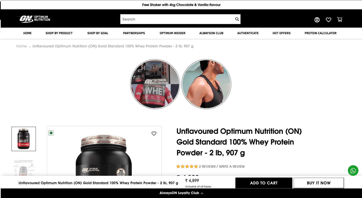

Outcome
Clear, evidence-based picture of where the ecommerce experience was failing users. Prioritised roadmap separating immediate improvements from strategic investments. Retail website design work delivered to production-ready standard with zero guesswork for development teams. Two rounds of implementable solutions gave the brand a clear path: quick wins they could act on, and structural improvements designed to hold up long-term.