Artreum Construction

Artreum Construction

Real estate website design

Real estate website design

Brand identity agency

Brand identity agency

Branding agency in bangalore

Branding agency in bangalore

Visual identity

Visual identity

Artreum builds at the top of the real estate and infrastructure market. Their brand was quietly arguing the opposite - and losing them credibility before the first conversation. Closing a gap that wide isn’t a logo refresh. It’s a positioning problem. That’s the kind of problem we’re built for.

Artreum builds at the top of the real estate and infrastructure market. Their brand was quietly arguing the opposite - and losing them credibility before the first conversation. Closing a gap that wide isn’t a logo refresh. It’s a positioning problem. That’s the kind of problem we’re built for.

The Brief

Artreum had the portfolio: high-calibre real estate and infrastructure projects, an established reputation, work that wins on merit. What they didn’t have was a brand that said any of it. So the brief wasn’t “make us a nicer logo.” It was sharper: make the brand match the work. Close the gap between what Artreum delivers and what a prospect assumes before the first meeting. A logo project ends at a logo. A positioning project touches everything - identity, typography, colour, the website, every surface a client sees. Artreum asked for the second one. Which means the work either holds together as a system, or it doesn’t hold at all.

Premium work, entry-level brand

Most construction brands look identical. Hard hats, a blue gradient, a stock crane against the sky. The category has a uniform - and wearing it makes every firm interchangeable, which is exactly the wrong signal when your whole pitch is that you’re not. Artreum’s work was premium. The brand read generic. No consistent type system, no visual language holding things together, and a website that undersold the very portfolio it was meant to showcase. The result was a perception gap: prospects reached a verdict on the brand long before they saw the buildings. In a market where high-value clients decide who to even talk to on first impression, that gap isn’t cosmetic. It’s lost work.

The Brief

Artreum had the portfolio: high-calibre real estate and infrastructure projects, an established reputation, work that wins on merit. What they didn’t have was a brand that said any of it. So the brief wasn’t “make us a nicer logo.” It was sharper: make the brand match the work. Close the gap between what Artreum delivers and what a prospect assumes before the first meeting. A logo project ends at a logo. A positioning project touches everything - identity, typography, colour, the website, every surface a client sees. Artreum asked for the second one. Which means the work either holds together as a system, or it doesn’t hold at all.

Premium work, entry-level brand

Most construction brands look identical. Hard hats, a blue gradient, a stock crane against the sky. The category has a uniform - and wearing it makes every firm interchangeable, which is exactly the wrong signal when your whole pitch is that you’re not. Artreum’s work was premium. The brand read generic. No consistent type system, no visual language holding things together, and a website that undersold the very portfolio it was meant to showcase. The result was a perception gap: prospects reached a verdict on the brand long before they saw the buildings. In a market where high-value clients decide who to even talk to on first impression, that gap isn’t cosmetic. It’s lost work.

Identity first. Then everything else.

We resolved the brand completely before a single page of the website was designed. That sequence is the whole game. When the identity is settled - type, colour, the rules for how things behave - the site gets built on a foundation instead of patched into coherence later. Decisions compound instead of conflicting. It’s slower to start and far faster to finish. More importantly, it’s the only way the system stays consistent once it leaves your hands.

Three pillars, no decoration

The identity was built on three things Artreum actually stands for: reliability, innovation, and craftsmanship. Reliability meant solidity in every choice - no trend-chasing, nothing that dates. Innovation meant reading modern and forward-looking without forfeiting the credibility the industry runs on. Craftsmanship meant precision at every scale, from a business card to a site hoarding. Those weren’t adjectives in a deck. They were the filter every decision passed through: a logo built on considered geometry, a restrained premium palette, and type engineered to stay authoritative whether it’s three storeys tall or three centimetres wide.
The Restraint

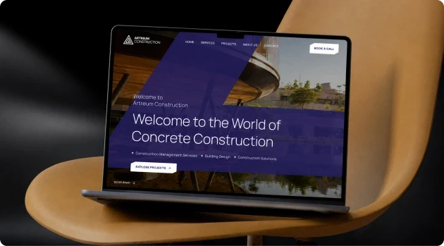
The biggest risk with a premium brand isn’t under-designing. It’s over-designing. When the work looks complicated, the company looks complicated - and complexity reads as insecurity, not authority. So we pulled back everywhere the instinct was to add. The graphic language is geometric and disciplined, not decorative. The layouts breathe. The hierarchy is clear without shouting. Every element earns its place or it’s gone. Restraint like that is harder than ornament. It takes confidence that the structure itself is doing the talking - so the surface doesn’t have to work overtime to prove anything.
TWD Studios
TWD StudiosTWD StudiosTWD StudiosTWD Studios

Ready to

build to ship?

Tell us what you’re working on. We’ll come back within one business day with a point of view, a likely team, and a timeline.

Ready to

build to ship?

Tell us what you’re working on. We’ll come back within one business day with a point of view, a likely team, and a timeline.

Ready to

build to ship?

Tell us what you’re working on. We’ll come back within one business day with a point of view, a likely team, and a timeline.

Resources

Follow Us

Copyright © 2026 TWD Studios, All rights reserved.

Resources

Follow Us

Copyright © 2026 TWD Studios, All rights reserved.

Resources

Follow Us

Copyright © 2026 TWD Studios, All rights reserved.