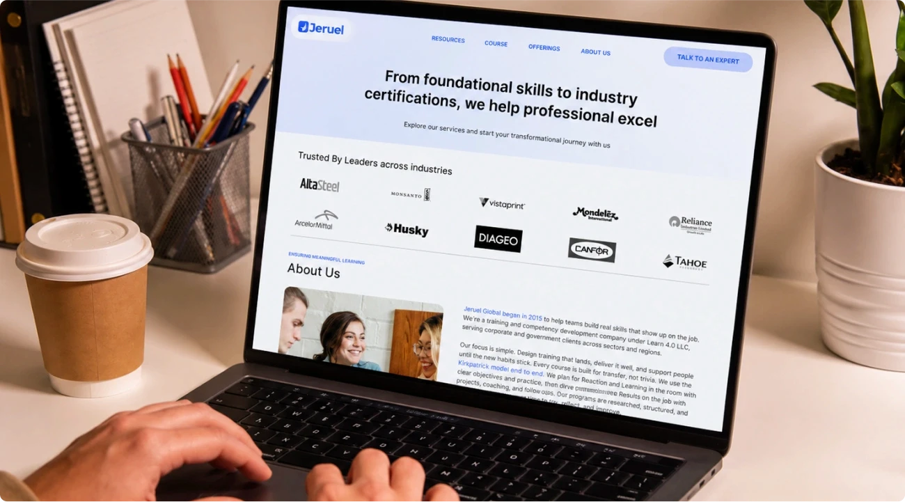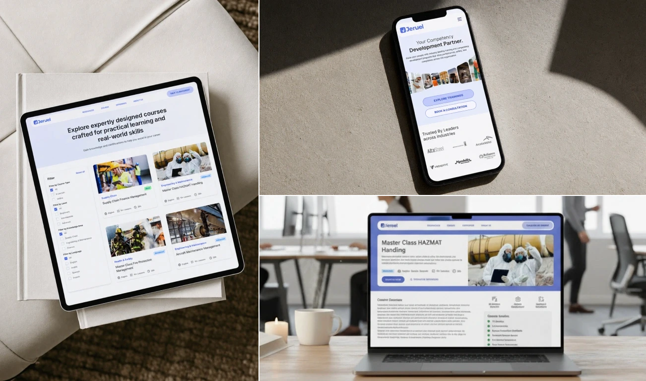
Visual Identity
The visual identity is clean, substantial, and deliberately international — distinctive in a sector that defaults to forgettable corporate design. The brand works in a London conference brochure, a Houston boardroom, and a Bengaluru marketing deck equally well. That was the brief. That is what was delivered.
Deliverables
Full brand identity system — logo, colour, typography, guidelines. Information architecture and navigation taxonomy. Full content restructure and rewrite across all programme, sector, and organisational pages. High-fidelity website design across all key pages at desktop and mobile. Technical SEO framework embedded in site structure. Schema markup for training programmes.
Outcome
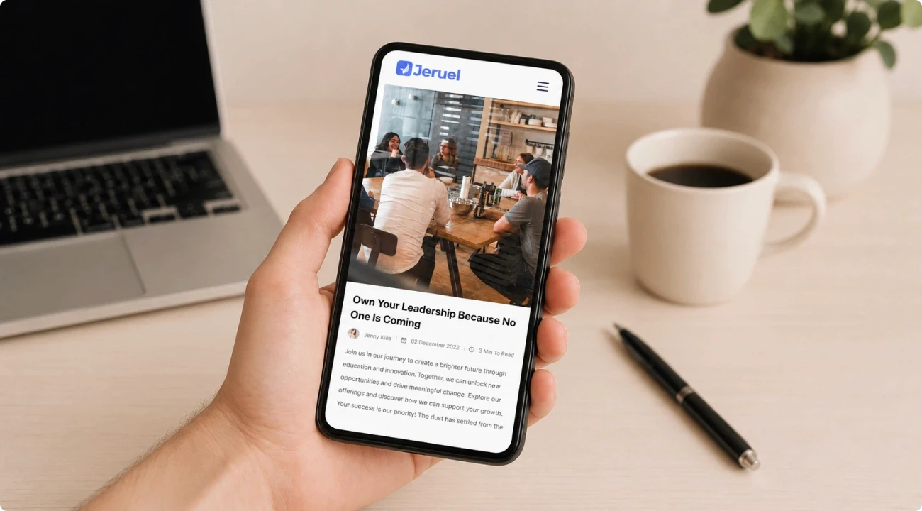
The brand identity now communicates international credibility aligned with the level at which Jeruel operates. The professional services web design is built for organic search performance from launch. Content is restructured around how corporate and government buyers evaluate providers. The technical SEO foundation means the site earns visibility as it grows, not after a retrofit.