Conversion Architecture
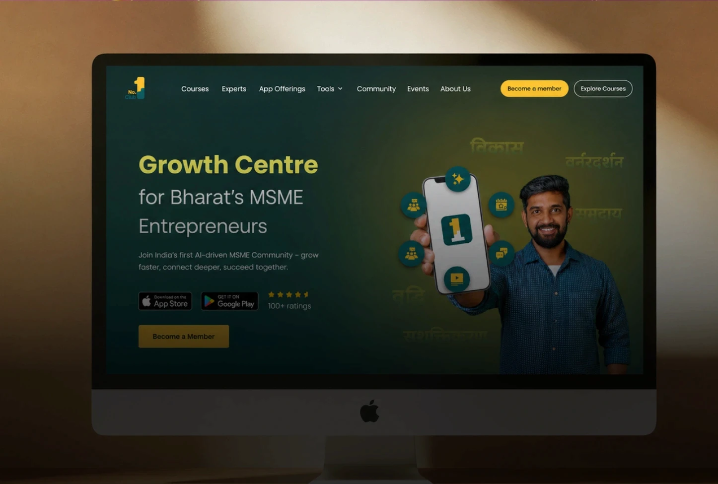
Page structure built around a single conversion goal: membership sign-up. Value proposition and membership offer established above the fold. Single primary CTA reinforced at consistent intervals throughout the page. Trust signals, community size, expert credentials, testimonials, social proof, positioned at specific hesitation points, not decoratively. Pricing redesigned to remove ambiguity and reduce perceived risk. This is web design for startups and high-growth platforms built around outcomes.
Developer Handoff
Handoff treated as a primary deliverable. Organised Figma file structured for developer navigation. Full component library with variants, hover, active, and disabled states. Spacing tokens, column grids, breakpoint specs. Named type styles and colour variables as design tokens. Interaction annotations. Asset exports. Design QA support during the build.

Outcome
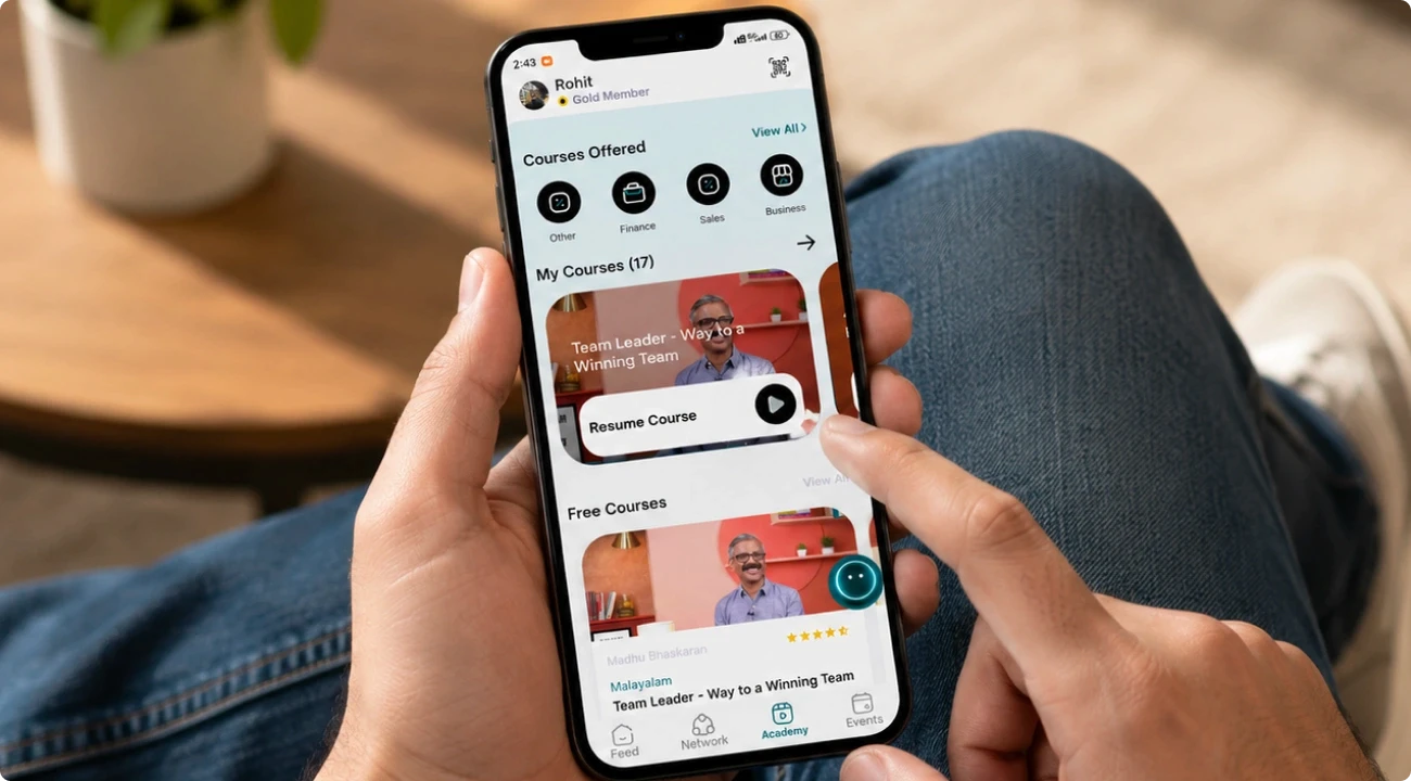
Website redesigned to serve the performance marketing funnel rather than undermine it. Every page section works toward a single conversion objective. Mobile experience leads design, aligned with actual traffic composition. Paid traffic now lands on a page built to convert it. The handoff quality enabled the client's Next.js team to build without design translation. This is what real conversion rate optimisation looks like when applied to a web design for startups context.